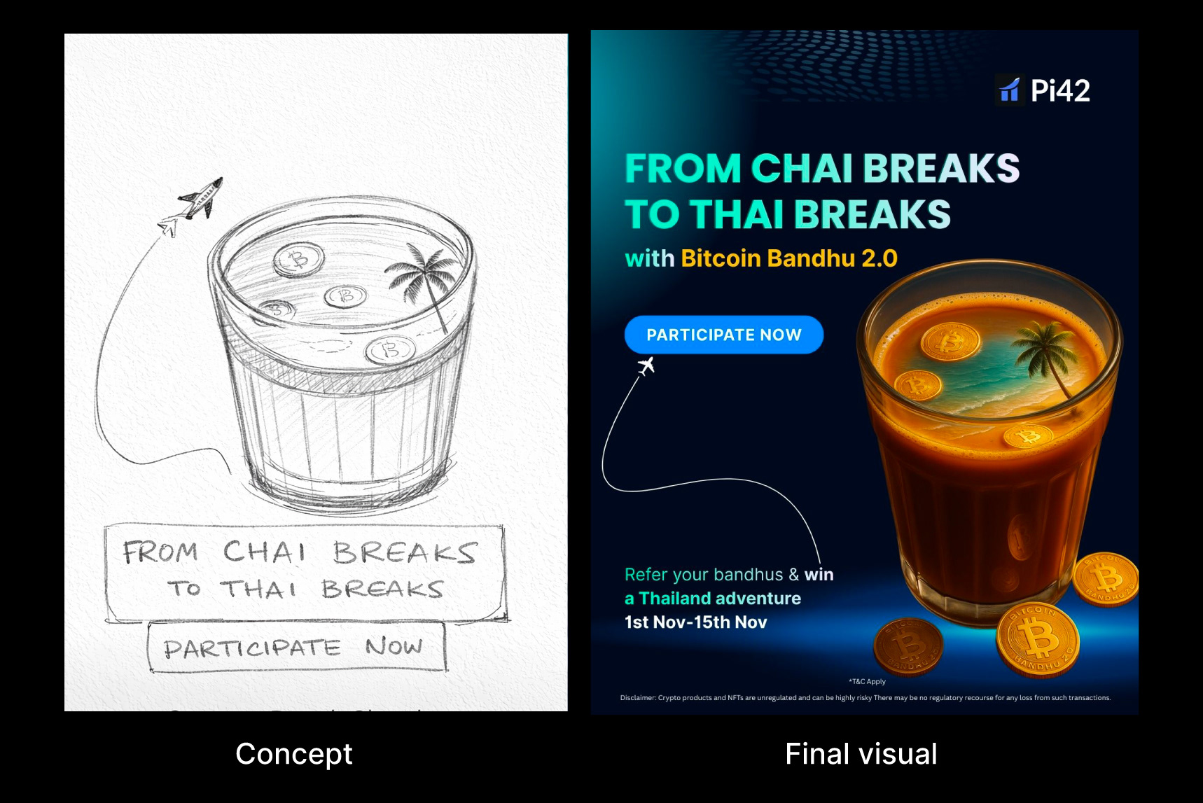
From Chai Breaks to Thai Breaks
A playful yet premium campaign visual created for Bitcoin Bandhu 2.0 by Pi42. The concept blends everyday Indian culture with aspirational global travel transforming a simple chai break into a Thailand getaway. Using surreal visual storytelling, Bitcoin coins merge seamlessly into a cup of chai that doubles as a tropical escape, symbolizing how referrals can turn small moments into big rewards.

BRIEF
Design a social media contest post for Pi42’s Bitcoin Bandhu 2 referral campaign. The post needed to highlight the contest and reward clearly while keeping the tone fun and approachable. It was created to perform across multiple social platforms in a fast-scroll environment.
CHALLENGE
Crypto contest creatives often get crowded with information and lose attention fast on social feeds. The challenge was to promote a referral-based contest while keeping the message light, aspirational, and instantly understandable without making crypto feel complex or intimidating.


IDEA
Turn an everyday Indian habit into a dream outcome. The concept connects something as familiar as a chai break to the idea of an international getaway. “From Chai Breaks to Thai Breaks” became the central hook simple, playful, and easy to remember. Bitcoin coins floating inside a chai glass visually bridge crypto with everyday life, making the campaign feel approachable rather than complex.
EXECUTION
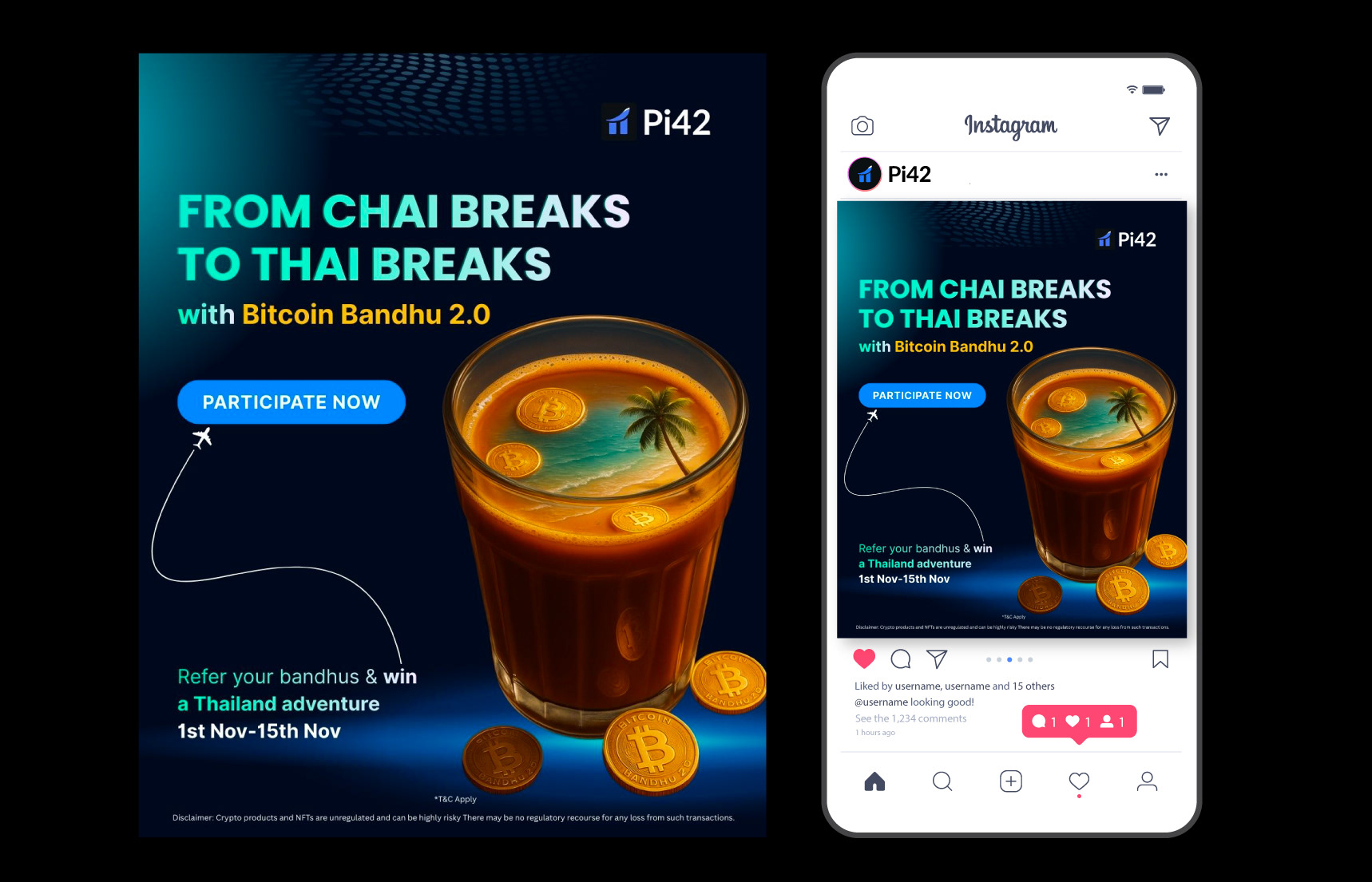
The concept began with the simple idea of a “Chai Break a comforting pause in the day to enjoy a cup of chai. I wanted to give it a fun, imaginative twist, so I envisioned it as more than just a drink: a mini escape, a tiny vacation inside the chai glass. I first sketched the concept, exploring how to merge the chai and beach visuals without losing clarity. Once the initial layout was ready, I refined the details and added depth using AI software, giving it a polished, social-first finish. A dark gradient background was added to make the hero image pop, while the bold headline, minimal copy, and clear hierarchy ensured that the contest details and CTA were instantly readable across social media platforms.
IMPACT
The design uses a familiar chai cup with a Thailand travel reflection to instantly connect with the audience and clearly explain the referral bonus. This simple visual idea helped users understand the campaign message quickly without needing much explanation.
The creative was shared across Instagram, blogs, LinkedIn, and with existing customers. It reached over 2 million users, increased website traffic, and led to higher clicks and participation in the contest.
By turning a crypto referral campaign into a relatable and visually engaging social post, the design became eye-catching, easy to understand, and effective in driving action making the campaign a success.

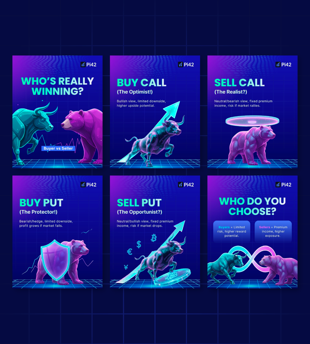
Who’s Really Winning? Buyer vs Seller
BRIEF
Pi42 wanted to simplify options trading concepts for social media audiences. The brief was to explain the difference between buyers and sellers and their respective strategies in a way that felt intuitive, visually engaging, and easy to understand for both new and experienced traders. The content needed to educate without feeling textbook-heavy, while staying aligned with pi42’s clean, performance-driven brand language.
CHALLENGE
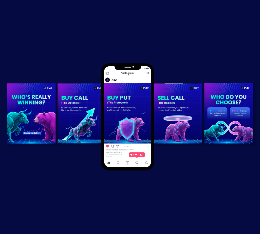
Options trading concepts are inherently complex and often intimidating for beginners. The challenge was to break down ideas like Buy Call, Sell Call, Buy Put, and Sell Put into clear mental models without oversimplifying or losing credibility. At the same time, the creatives had to work in a fast-scroll environment and remain visually consistent across a multi-slide carousel.
IDEA
The core idea was to personify trading strategies using universally understood market symbols the bull and the bear. Each strategy was framed as a distinct personality (Optimist, Realist, Protector, Opportunist), helping users instantly associate behaviour, risk, and reward with a visual cue. By pairing character-driven visuals with short, sharp copy, the content becomes easier to scan, remember, and differentiate..
PROCESS
I began by mapping each trading strategy to Market sentiment, Risk exposure, Reward potential This helped define which visual metaphor best represented each concept.
The carousel flow was planned to move from comparison → explanation → decision-making .
Copy was reduced to its most essential form to avoid cognitive overloadVisual hierarchy was designed to ensure headlines were readable within the first few seconds.Each slide was designed to stand alone while still feeling connected as part of a single narrative.
IMPACT
The carousel helped translate complex options strategies into a visually digestible format, making educational content more approachable without diluting technical accuracy. It strengthened Pi42’s presence as a platform that simplifies trading knowledge while maintaining credibility in a competitive crypto space.
Spin to Zero Fees
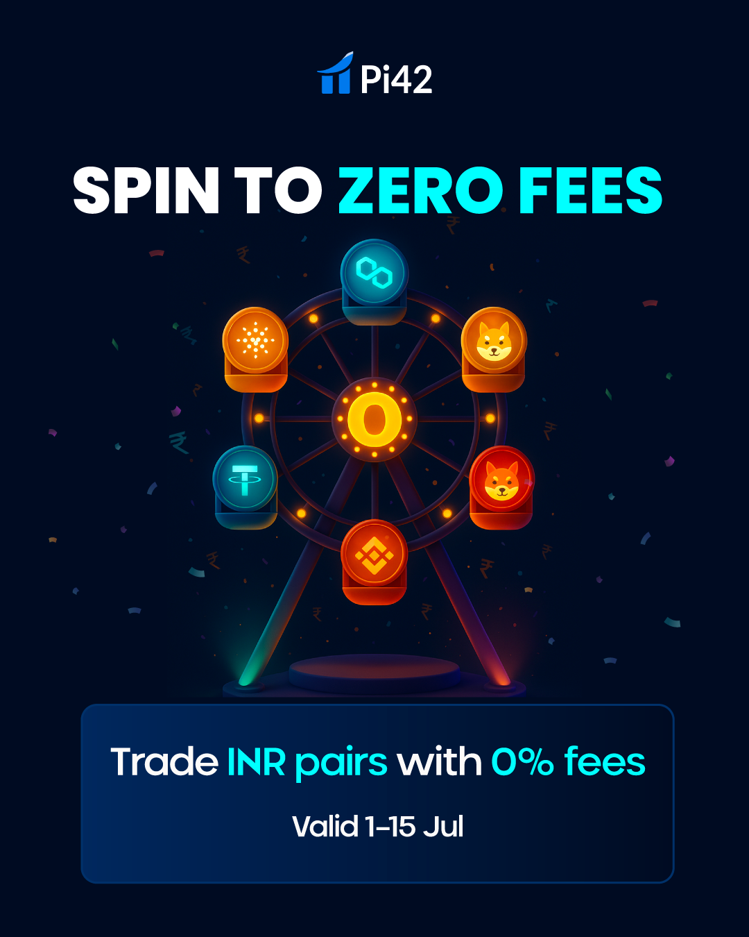
CONCEPT
When I got the brief for Pi42’s Zero Fees for 15 Days trading contest, my first thought was to avoid making it look like another serious, number-heavy trading post. The offer itself was strong, so I wanted the visual to feel exciting and memorable.
I started thinking about movement because trading never feels static. That’s when the idea of a carnival came in. Carnivals are all about energy, motion, and people coming back for more, which felt very similar to how active trading works. From there, the Ferris wheel clicked naturally it rotates continuously and visually allowed me to place multiple INR trading pairs while keeping one strong center point.
I then finalized the Ferris wheel with crypto coins as cabins and placed a glowing “0” at the hub to clearly position zero fees as the main driver of the campaign. The headline “Spin to Zero Fees” came from directly linking the wheel’s motion with the offer simple, intuitive, and instantly understandable.
I kept the layout minimal so the visual stays dominant, using the supporting line “Trade INR Pairs with 0 Fees” only to clarify the message. To elevate the static design, I added very subtle motion using Runway AI—slow wheel rotation, a soft pulse on the “0,” and minimal confetti with ₹ symbols just enough to add liveliness without distracting from the offer.
Motion Rationale
The wheel rotates slowly to create liveliness without distraction. The central “0” pulses like carnival bulbs, drawing attention naturally. Confetti and ₹ symbols fall steadily in the background, adding festivity while staying minimal. Headline flicker animation echoes the carnival signage aesthetic, while the subheading fade keeps readability clear and professional.
Google Ad Creative

CONCEPT
For the Google Ad, the design was kept direct, compact, and highly legible since ad placements demand instant clarity. The focus is on the key message, Zero Fees for 15 Days, supported by a clean festive accent that ties back to the carnival theme.
VISUAL
Unlike Instagram, where motion and storytelling can unfold, the Google Ad needed a more straightforward static approach. The Ferris wheel element is simplified to keep recognition consistent, while the bold “0” and confetti subtly carry over the celebratory mood.
CTA PLACEMENT
A strong CTA button (“Trade Now”) was added at the bottom for quick action. The contrasting color ensures it stands out immediately, encouraging clicks.
Illuminati 2: Zero Fees, Maximum Impact

BRIEF
Design a promotional campaign for Illuminati 2, a trading contest focused on zero-fee INR pairs. The creative needed to feel bold and dramatic, work across multiple digital formats, and clearly communicate the core message at a glance.
IDEA
A dark, futuristic visual inspired by the idea of Illuminati used symbolically, not literally to create intrigue. The ₹ symbol was highlighted as the central element, representing the power of zero-fee INR trading.
IMPACT
The dramatic visual approach helped the campaign stand out across platforms and clearly communicate the zero-fee message. Through this contest, over 1 million users traded, driving high engagement, strong participation, and increased activity across INR pairs.
Santa Arrived Early

VISUAL APPROACH
This visual was designed within Pi42’s existing brand color palette, ensuring strong brand recall while adapting it to a festive context. Instead of introducing new holiday colors, I intentionally worked with Pi42’s blues, purples, and gradients to keep the design on-brand, consistent, and instantly recognizable across platforms.
The challenge was to make a Christmas-themed post feel festive without breaking brand identity. To solve this, I used light, glow, depth, and motion cues rather than traditional reds or greens to evoke the Christmas mood. The result feels seasonal yet unmistakably Pi42.
Conceptually, I approached this as a story moment rather than a static announcement. The idea of “Santa arriving early” acts as a metaphor for early benefits and opportunities for traders. Santa’s forward motion symbolizes speed, momentum, and progress values closely aligned with trading behavior.
Crypto elements like Bitcoin and Ethereum were placed thoughtfully within the scene, not as decorative icons but as part of the narrative space Santa is moving through. This ensures the trading context remains clear while the storytelling stays light and engaging.
Collectors Then. Traders Now.
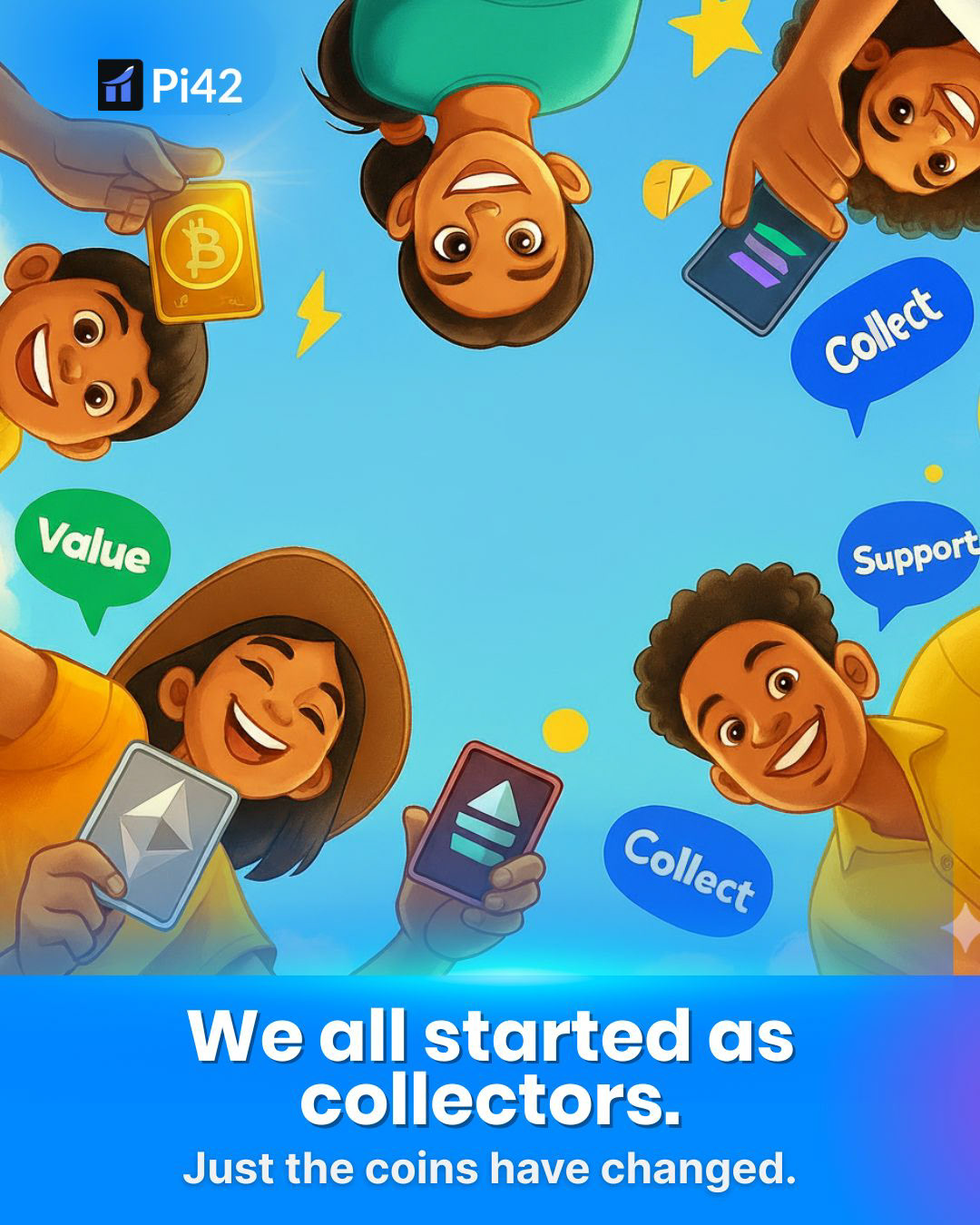
BRIEF
The brief was to create a Children’s Day engagement post that feels nostalgic, warm, and human while still staying relevant to the crypto and trading ecosystem. The challenge was to talk about digital assets without making it feel technical, financial, or intimidating, especially on a day centered around childhood and innocence.
CONCEPT
I approached this concept by going back to a universal childhood memory: collecting things coins, cards, stickers, small treasures that felt valuable simply because they were ours. This became the emotional bridge to introduce crypto in a way that feels familiar rather than complex.
The line “We all started as collectors. Just the coins have changed.” became the core idea. Instead of explaining crypto, the visual shows the evolution of value from childhood collections to digital assets making the message intuitive and relatable. I intentionally used childlike expressions, warm illustrations, and playful compositions to reflect joy, curiosity, and community. The circular arrangement of characters looking inward reinforces togetherness and shared beginnings, echoing the spirit of Children’s Day.
VISUAL
The design stays aligned with Pi42’s brand palette, adapting it to a softer, more playful tone without breaking brand consistency. Rounded shapes, friendly typography, and expressive characters were chosen to reduce the perceived seriousness often associated with crypto content. Crypto symbols are introduced subtly, treated as collectibles rather than financial instruments keeping the focus on emotion first, concept second, and brand naturally integrated throughout. The layout was designed to work seamlessly across social media and digital platforms, ensuring instant clarity and emotional impact even in fast-scroll environments.
IMPACT
The final outcome is a highly relatable, emotionally driven post that reframes crypto through nostalgia and storytelling. By connecting childhood habits with modern digital behaviour, the design lowers entry barriers and invites engagement without feeling promotional or instructional. This Children’s Day concept successfully humanises crypto, making it approachable, warm, and inclusive especially for first-time or curious audiences.